Bobo & Bob
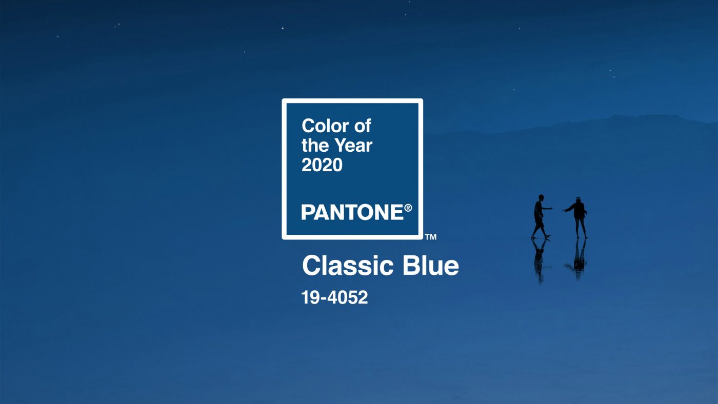
Colour of the Year 2020: Classic Blue
Pantone have announced their annual Colour of the Year, this is anticipated by designers across hundred of industries. In the past, colours have included Living Coral, Ultra Violet and Greenery. These also inspire new colour palettes for industries to work with, Pantone provide five original schemes involving their existing colours.
For 2020, Pantone have chosen Classic Blue
The Controversy
Last year, Pantone came under fire for naming the Colour of the Year ‘Living Coral’. Many thought that they had missed the mark due to the ocean’s coral being in extremely short supply.
This year, Classic Blue has been described as “elegant in its simplicity”. “reflective” and “an anchoring foundation”, a safe choice for Pantone.
In her article “In choosing blue, Pantone has missed the mark once more” Michelle Ogundehin states that “Such an influential global institution, professionally dependent on industry recognition of its colour sense, couldn’t afford another such politically insensitive misstep”. So, after playing it safe, Pantone are still facing backlash.
Our Products
Finally, we offer a vast range of colours for our products, in various finishes and thicknesses. The closest colours we have to the Pantone Classic Blue would be Navy Blue and Sapphire Blue Frost. For more information about our colours, swatches and finishes, check out our swatches page here. We also have a new collection of products using this Navy Blue with a starry sky design, including a clock, socket surround and personalised door sign.